The plots are generated with Plotly JS, please wait for few seconds for all the plots to be generated.
The countour plots are dynamic, you can hover over them and read the results, or zoom in and zoom out.
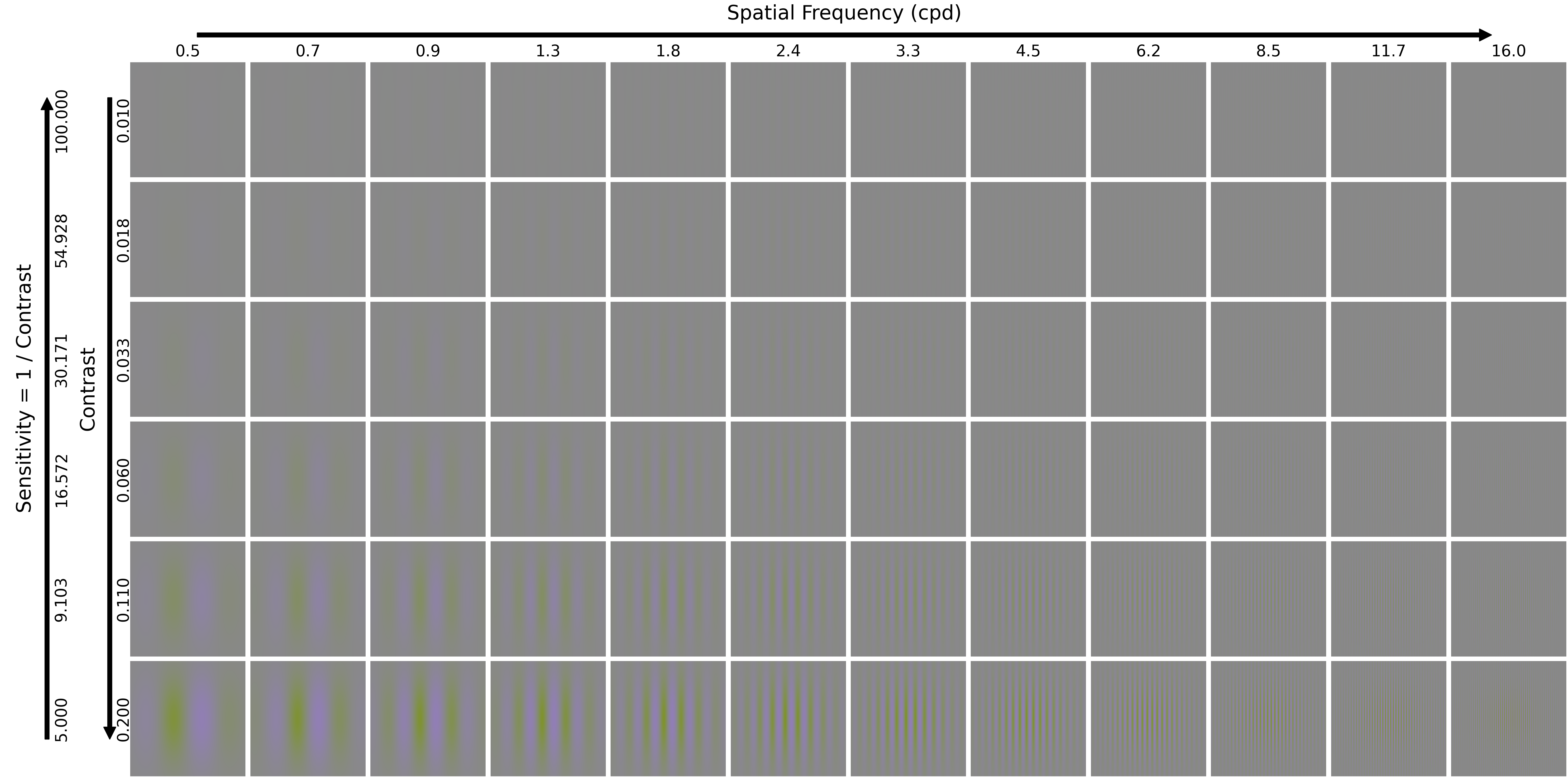
Each contour plot corresponds to the results of a model for the "Contrast Detection - Spatial Frequency - Yellow-Violet Gabor" test in terms of the latent space dissimilarity Sac, while the red line corresponds to the ground truth. The test stimuli examples can be found here.